Thanks for visiting my blog!
This is the ninth of ten parts of this blog post. The topics will be:
- 1: A New World
- 2: Architecting JavaScript
- 3: A Better CSS
- 4: Debugging
- 5: Joy and Pain of jQuery Plugins
- 6: Packaging Assets
- 7: Distributed Version Control
- 8: Working with Facebook
- 9: Mobile Pages (this post)
- 10: Deploying to the Cloud (upcoming)
Why do users complicate our lives by trying to view our content on their phone and tablets? It’s even an issue for smaller sized desktop screens too. Since this is simply a reality for today’s web developer I was glad to see there were real strides in working with mobile.
Ways to Handle the Mobile Web
In general there are three techniques for dealing with mobile device browsers:
- Mobile Site: Write a version of your site specifically for mobile browsers/phones.
- Mobile Pages: Write mobile specific pages for individual pages in your site.
- Responsive Design: Adapt pages to work with mobile devices.
Which should you choose? Well, that depends…
While building a mobile site is been a standard way of doing business for a while (ahem m.foo.com is the pattern, right?), it involves more work and occasionally separate engineering efforts. This is still an option, but I think it should become more uncommon.
Building mobile pages is closer to what an software guy might suggest, but that can be a lot of engineering effort too. Imagine building every page twice (or more). But you don’t have to. The last technique is to use “Responsive Design”. Let’s dig into how that works, then we’ll add Mobile Pages to fill in the gaps (this is my take on the right approach).
Responsive Design
The basic tact of responsive design is to design your pages (and site) to react to changes in browser size. This means on different devices, you can have your site *respond* to the change. Instead of complex logic to sniff the type of device and a database screen sizes, you can use CSS specify changes to your design based on screen size.
A CSS media query is the key to getting this to work. A media query device type (in our case, screen) and size help you create exceptional case CSS for specific device types. A typical example in responsive design is defining that you want a ‘screen’ and a specific range of widths:
@media only screen and (min-width: 960px) {

}
This allows you to have rules that apply to only certain widths of an app. This works well to allow you to change formatting for desktop, then tablet, then phone.
/* fallback */
#main
{
width: 989px;
}
/* Tablet Portrait size to standard 960 (devices and browsers) */
@media only screen and (min-width: 768px) and (max-width: 959px)
{
#main
{
width: 760px;
}
}
/* Mobile Landscape Size to Tablet Portrait (devices and browsers) */
@media only screen and (min-width: 480px) and (max-width: 767px)
{
#main
{
width: 472px;
}
}
/* Mobile Portrait Size to Mobile Landscape Size (devices and browsers) */
@media only screen and (max-width: 479px) {
#main
{
width: 400px;
}
}
```csharp
The idea behind this is to define rules that apply everywhere (and most of your rules will not be inside of media rules) and then for specific screen sizes, create rules that override the default rules. For example, the 1024px width for **#main** works in the browser, but when you resize your window to be < 960px(or open it on a device with the right resolution), the size of **#main** changes to 755px. This is to ensure it fix on smaller resolution devices. This continues for the different size screens all the way down.
Note that in the browser tools, you won't see the media rules, they'll just be applied. So on my laptop, when I look at the matching rules for **#main** I get:

Because the page size is > 960px at this time, I only see the first #main definition that defines the width. But if I reduce the size of the window to be smaller than 960px, the rules change as the media rule kicks in:
[](http://wilderminds.blob.core.windows.net/img/4-29-2012%207-24-22%20PM_2.png)
In this case we see both the original #main rule and then the #main added in the media query section and since the media query happened after the first declaration, it takes precedence.
If there are elements of the page (e.g. ".centered") that aren't different for the screen size variations, I don't need to duplicate them since their in the main CSS scope.
For example, I've created a simple design with a container and a way to float boxes next to each other when the screen is wide:
[](http://wilderminds.blob.core.windows.net/img/4-29-2012%207-32-56%20PM_2.png)
When the screen is large (e.g. 1024px wide as shown), it looks great. The menu items are floated to the right top, and the three columns are just floated sections. When I go down below 960px I simply change the sizes of the columns:
[](http://wilderminds.blob.core.windows.net/img/4-29-2012%207-33-27%20PM_2.png)
But you can completely change the rules to change the look, like when we're below 768px:

In this case, I am keeping the columns to be farily wide, but no longer floating them as on a small screen (like a phone) floating makes them too small to be useful. In addition, you can change other elements (like the menu is stacked below the logo instead of floated to the right. You can make design decisions about what looks best on the right size device.
In all of these cases, these changes are made in the design artifacts (e.g. CSS) and not in code. So that you still have a single code block for a particular page, even very complex ones. But sometimes even that isn't enough.
### Mobile Pages
There are times when you want a completely different experience for mobile users than typical web users. This may not be a solution for the entirety of a site, but only applicable on special pages (e.g. data entry screens). For those times when you need special mobile pages, ASP.NET MVC4 has a great way to handle this (though there are hacks to work with MVC3 and get this behavior). The trick is to simply create a new view and name it {page}.mobile.??html (e.g. Contact.Mobile.cshtml). By default, it will find the mobile page (if it exists) for mobile devices. For example:

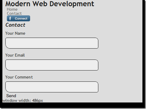
Why a specific page for mobile? One big reason is to use mobile frameworks (e.g. KendoUI Mobile or jQuery Mobile). My non-mobile version of my contact page looks like you might expect (using a \_layout page):
```xml
@* Contact.cshmtl *@
@model ModernWebDev.Models.SomeFormModel
@{
ViewBag.Title = "Contact Us!";
}
@section Stylesheets
{
<link rel="stylesheet" href="~/Content/Home.Contact.less" />
}
<h2>
Contact</h2>
<section class="big-form">
@using (Html.BeginForm())
{
@Html.ValidationSummary()
@Html.EditorFor(m => m)
<input type="submit" value="Send" />
}
</section>But for the mobile page, I could use jQuery Mobile to show off the page:
@* Contact.mobile.cshmtl *@
@model ModernWebDev.Models.SomeFormModel
@{
  Layout = null;
  ViewBag.Title = "Contact Us!";
}
<!DOCTYPE html>
<html>
<head>
  <title>Modern Web Dev - Contact</title>
  <meta name="viewport" content="width=device-width, initial-scale=1">
  <link rel="stylesheet" href="~/Content/jquery.mobile-1.1.0.min.css" />
</head>
<body>
  <div data-role="page">
    <div data-role="header">
      <h1>Modern Web Dev</h1>
    </div>
    <!-- /header -->
    <div data-role="content">
      <h2>Contact (Mobile Version)</h2>
      <section class="big-form">
        @using (Html.BeginForm())
        {
          @Html.ValidationSummary()
          @Html.EditorFor(m => m)
          <input type="submit" value="Send" />
        }
      </section>
    </div>
    <!-- /content -->
  </div>
  <!-- /page -->
  <script src="~/Scripts/jquery-1.7.2.min.js"></script>
  <script src="~/Scripts/jquery.mobile-1.1.0.min.js"></script>
</body>
</html>
Note that I am setting the Layout to null to prevent using the Layout page as my ‘master page’ but doing it all in this page. But since this page is relying on sniffing the browser to detect a site, how do I trigger it? Magic? Nope, Safari!
The trick is to use Safari as it has the ability to send iPhone, iPad and iPod request headers. How does it work? Let me show you.
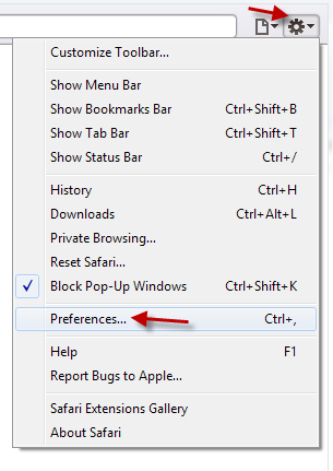
If you have Safari installed, you’ll need to enable the developer menus by opening preferences:
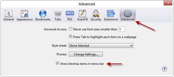
Then on the Advanced Tab, show the Developer menu:
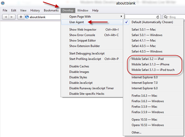
Once you have that you can enable them in the User Agent menu:
This will trigger the mobile versions. The contact page with the default User Agent:
And the jQuery Mobile version once I change the User Agent to “iPHone”:
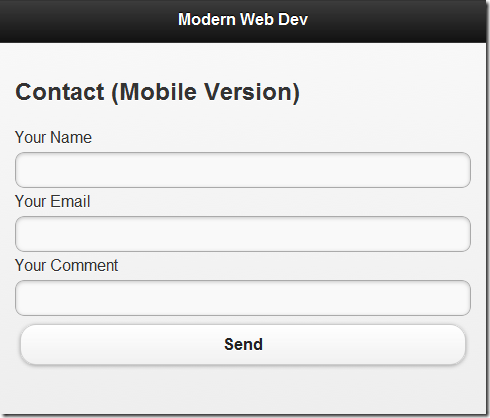
Using Mobile Pages allows you to have specific parts of your site use these mobile frameworks but not requiring whole separate sites.
Combining the two efforts (Responsive Design and Mobile Pages) I think is the best of both worlds. I don’t see a realistic place for creating separate sites.
Here’s an example of using these two techniques together:
What do you think?

