Thanks for visiting my blog!
I recently finished my Blood Sugar monitoring app (“Stay Glucose to Me”) for the Windows Phone 7. I battled with the idea of which of the Metro styles to use for my application. Since the new Windows Phone 7 tools shipped with a Panorama control, I started there. What I find most interesting about the iterations of design I went through was how a real app can use (and probably should) use a couple of different metaphors. I could easily see a Pivot or Panorama for a home page then individual pages (that might still have individual simple pages).
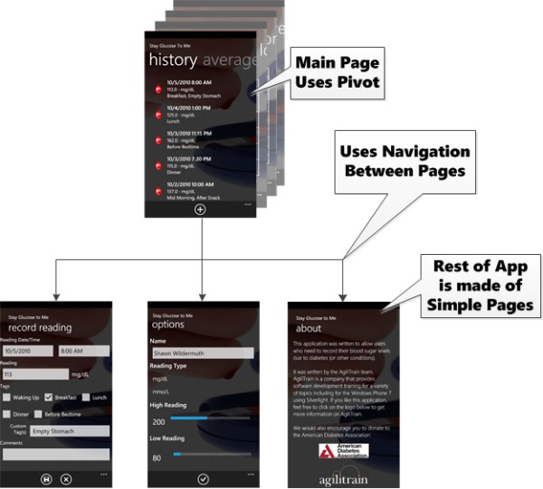
For the application, I ended up using the pivot for my landing page of the application so I could show the raw data and graphs but then use page navigation to go to other pages. For example, here is a simple page layout of the blood monitoring application:

This means that even though I started with a Pivot application, there was quite a lot of work making all of the user interfaces, not just he landing page. This makes me think that many apps will really be a mix of all of these different types of controls. While there are Pivot and Panorama application templates, I think it will be more common to use these as ‘controls’ in a larger sense of mature apps. Though because it is a phone, these apps do have a logical maximum size.
Like I’ve talked about in other posts, I decided that in this example to use a Pivot instead of the Panorama mostly for performance reasons. The Pivot can be more virtualized for longer lists of information. In my case, I wasn’t sure how many graphs I was going to support so I wanted to be able to virtualize the individual pages (via Load and Unload events) to lower memory utilization. That is simply not available in Panorama. I’ve heard several times from different people that you shouldn’t use more than four or five panes on a Panorama page because the total size of the page will really hammer the phone. Even the background on the Panorama (which looks cool) can be pretty memory intensive as it is converted into a bitmap so when drawn on the surface its taking a lot of memory (even if your image is small, its still turns it into a full-color image on the device).
I’ve had a lot of fun with this app and it will be a free application on the Marketplace once it opens up.
